A SolvePro tutorial
In this tutorial we explore the Rangeint, Rangenum and associated functions and use these to generate a number of vectors to demonstrate and display the main trigonometric functions. We’ll also create a series of charts or graphs to show the results.
Vectors are lists or series of numbers as described elsewhere. Various random vectors generators are available in SolvePro but in this tutorial we concentrate on vectors which not random but follow a defined pattern such as 0, 1, 2, 3, 4… or 5, 10, 15, 20…
Two range generator functions are currently available in SolvePro:
| Function | Description |
| Rangenum | Creates a vector range defined by the number of intervals required |
| Rangeint | Create a vector range defined by the size of the interval required |
The formal definition of the two range generators is as follows:
vector = Rangenum(start, end, number)
vector = Rangeint(start, end, interval)
where
vector is the resultant vector
start is the starting value
end is the last value
number is the number of values to be generated
interval is the increment between successive values
Other functions allow vectors to be joined together, or to remove various entries that are not wanted: This allows ranges to be created which are not necessarily contiguous.
| Function | Description |
| vjoin or vadd | Joins two vectors together to form one vector |
| vremove | Removes a single entry or multiple entries from the vector by position |
| vtable | Adds two vectors together to produce a vector table |
The formal definition of these functions is:
vector = Vadd(vector1, vector2)
table = Vtable(vector1, vector2)
where
vector is the resultant vector
table is the resultant table
vector1 is the first vector
vector2 is the second vector
vector = Vremove(vector1, pos, n)
where
vector is the resultant vector
vector1 is the source vector
pos is the position of the first item to be removed
n is the number of items to be removed
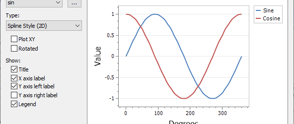
Sine and cosine
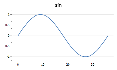
To display the common trigonometrical ratios, we need to first define what values we wish to evaluate. Working in degrees, a suitable range of values is 0 to 360. To define this range we can use the Rangeint function
x = Rangeint(0, 360, 10) = {37}
We’ve used a 10 degree interval as this produces sufficient values for the purposes of this tutorial. Note that the resultant vector, x has 37 values ranging from 0 to 360. Vectors can be viewed using the vview function
vview(x, 100, 1) = 0, 10, 20, 30, 40, 50, 60, 70, 80, 90, 100, 110, 120, 130, 140, 150, 160, 170, 180, 190, 200, 210, 220, 230, 240, 250, 260, 270, 280, 290, 300, 310, 320, 330, 340, 350, 360
Rather than use the Rangeint function, we could use the Rangenum function to generate the same 37 values
x = Rangenum(0, 360, 37) = {37}
Now the sine and cosine values for each of the source values for x can be created. Since we wish a value to be generated for each of the source values we need to ensure that that ‘Use vectors’ option is checked in the ActiveEqn box
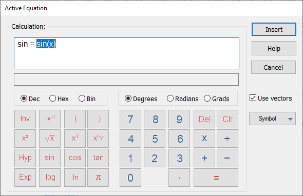
The Use vectors option needs to be checked whenever you want ActiveEqn to work with a vector quantity and generate a new vector. There are some exceptions to this requirement, but these are for functions which are designed specifically to work with vectors, such as the range generation functions. When there is a potential choice for a function as to whether to use a single value, or whether to use a vector of values (such as sin, cos or tan), then ActiveEqn needs to be told what type of calculation to perform.
So, ensuring that the Use vectors option is checked, vectors for sin and cos can be generated
sin = sin(x) = {37}
cos = cos(x) = {37}
Active graphs – simple charts
Now that the sine and cosine values have been generated we can display those values on a graph. The easiest and quickest way to create an ActiveGraph is to right-click on the Variables panel selecting the vector or table variable you want to create a graph from
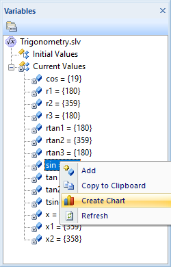
Select Create Chart and a chart showing the variable will be created.
Although this creates a simple chart very quickly, the chart will probably need some editing to show exactly the required information. Editing the chart is described in some detail in the next section and the editing dialog can be launched by double clicking on the chart.
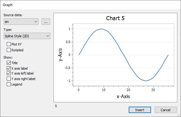
Active graphs – creating from scratch
To create a graph from scratch, click on the Insert tab and choose the Active Graph option. This displays the Graph dialog which is initially populated with some sample data.
From this dialog click on the down arrow in the Source data drop down box. This displays all the vectors which can be graphed in the current SolvePro document. We will start with the sin vector, so select that option. The display in the dialog immediately changes to display the sin vector.
The x-axis and various labels are not yet correct and we could do with adding the cosine curve on the same graph. Double-click on the main title or axis labels and a little dialog box will open allowing you to change the text.
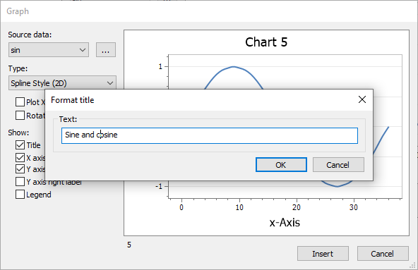
Click OK and the changes you make will be saved with the graph.
At this point the x-axis values range from 0 to 37, one category for each of the items in the sin vector. To change the x-axis values to match the degrees value from which they were calculated, and to add a new trace to the graph click on the … button to the right of the Source data dropdown box. This displays a Format Graph dialog
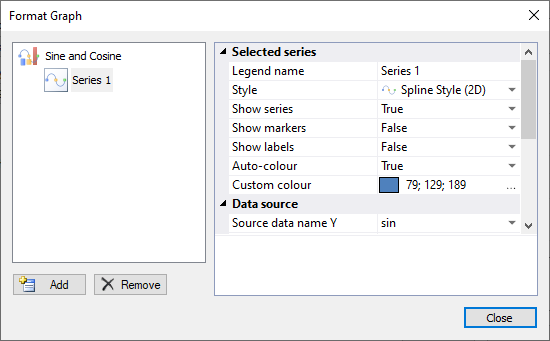
The Format Graph dialog allows you to customise the graph you have created in a variety of ways. In this tutorial we shall change the name of the sine series and change the x-axis labels to use the x values vector we created earlier. The first series created will already be selected, but if not then click on the Series 1 icon in the left-hand pane. In the right-hand pane the Legend name is top of the list. Click on the Series 1 text and change this to Sine.
Now scroll down the right-hand pane to display the Data source options fully.
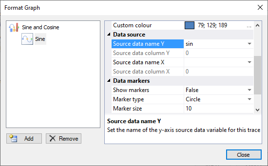
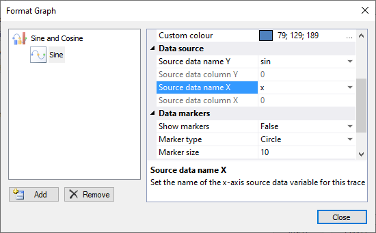
Note that the Source data name Y is the sin vector we selected earlier. We need to change the Source data name X value. At the moment it is blank. Using the dropdown arrow a list a vectors is displayed. Choose the x value from the list that is displayed
The source data column values are greyed out for both the sin and x values we have selected. This is because the column selection is only relevant for tables of vectors and allow a choice of the column to be used. We’ll create a table of vectors later in the tutorial to show how that feature can be used.
At the lower left of the Format Graph dialog are two buttons, one to add new series to the graph and the other to remove existing series. Click on the Add button. This creates a new series and since it is the second series for this graph it is called Series 2 by default.
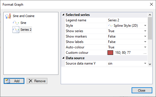
We can change the name of Series 2 to Cosine, just as we did for Sine earlier. Note however that the Source data name Y in the right-hand pane has defaulted to sin. This is because this is the source we selected for the graph as a whole. This needs to be changed to cosine using the dropdown box. In addition the Source data name X also needs changing to x, just as we did for the sine trace.
Once this is done click Close and the completed graph will be displayed in the dialog.
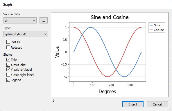
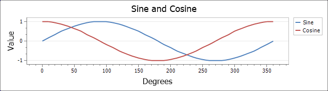
If you’d like the legend to be displayed, check on the Legend box at the bottom of the left-hand column of options. Click on the Insert button and the graph will be displayed on the page. To perform further editing, simply double-click on the image of the graph and the Graph dialog will be displayed.
If the graph is not the right size, it can be adjusted in two ways. Either resize the Graph dialog using the lower-right resizing handle before you Insert the graph or resize the image that is created on the page. If you resize the image on the page, then the image will probably appear a little blurred. This is because it is just an image and needs to be redrawn at the new size. Either double-click the graph to open it and then close the Graph dialog again, or press F9 or the Calculate button on the ribbon bar and the entire document will be recalculated, including a redraw of all the graphs.
Please note there are some constraints on the graph display size. If you try and create a graph which is too small, then not all the information can be displayed and you may get just a partial image.
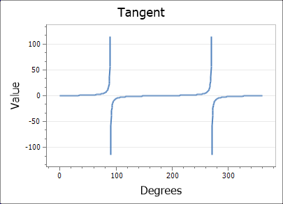
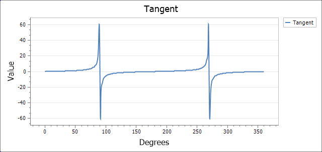
Tangent
Drawing a curve to display the tangent ratio is a little more complicated to set up due to the fact that the values of tan(90°) and tan(270°) are infinity. SolvePro graphs cannot display infinity so the easiest way to ensure that infinity is not reached is to ensure that values are not generated. For the 0 – 360 degree range we are using here, this means excluding the two values, 90° and 270°.
There are two ways this can be achieved. The first is to create a series of ranges and then join them together. The second is to remove the values we don’t want from an existing range and this method is discussed later.
The first method is performed below where ranges from 0 – 89, 91 – 269 and 271 – 360 and created and combined together using the Vjoin function.
x1 = Vjoin( Rangeint(0, 89, 1), Rangeint(91, 269, 1)) = {269}
x1 = Vjoin( x1, Rangeint(271, 360, 1)) = {359}
Now that the range has been created, the tan vector can be calculated (remembering to check the Use vectors option)
tan = tan(x1) = {359}
As before the tangent function can now be displayed on a graph
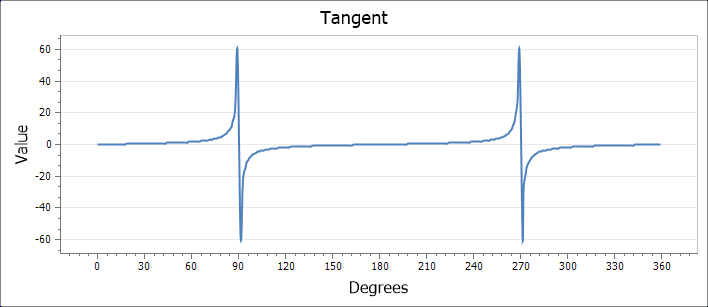
Rather than creating a discontinuous vector containing the values we require by joining various ranges together, we can create a single range and then remove the items we don’t want, i.e. 90, 180 and 270. The first stage is to create a complete range from 0 to 359
x2 = {360}
Next, we remove the items we don’t want using the position of that item in the source vector
x2 = Vremove(x2, 90, 1) = {359}
x2 = Vremove(x2, 269, 1) = {358}
Now we can create the result vector we require, tan(x2) in this case
tan2 = tan(x2) = {358}
And finally plot a graph of the result
Creating active graphs from tables
So far we have described methods to create a chart from several separate variables. We displayed sine and cosine values on the y-axis with another variable to create values for the x-axis. What would be helpful would be to create a graph showing all the required information in one go. This can be achieved by first creating a table of vectors with the first column containing the x values, the second sin values and the third column the cos values. The can be achieved using the Vtable function.
tsincos = {3, 37}
Note the way in which two Vtable functions are embedded into a single ActiveEqn. The result, tsincos contains three columns as desired.
Using the vview function we can view the first few entries of the table
vview(tsincos, 9, 0) =
| 0 | 0 | 1 |
| 10 | 0.174 | 0.985 |
| 20 | 0.342 | 0.94 |
| 30 | 0.5 | 0.866 |
| 40 | 0.643 | 0.766 |
| 50 | 0.766 | 0.643 |
| 60 | 0.866 | 0.5 |
| 70 | 0.94 | 0.342 |
| 80 | 0.985 | 0.174 |
Now we can right-click on the tsincos variable in the Variables panel and create an ActiveGraph directly
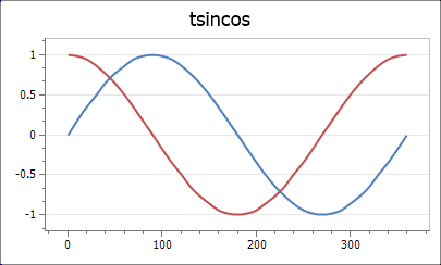
Here we’re likely to want to change the title and maybe display a legend and that can be achieved quickly by double clicking on the chart object to launch the editing dialog. If you’d like to create a graph from scratch using the Insert Graph tool then follow the guide below
Using vector tables to create graphs
Tables can also be used to create Active Graphs. Using the insert Active Graph button as before we can create a graph which uses the tsincos table directly. When the tsincos variable is selected we see the display
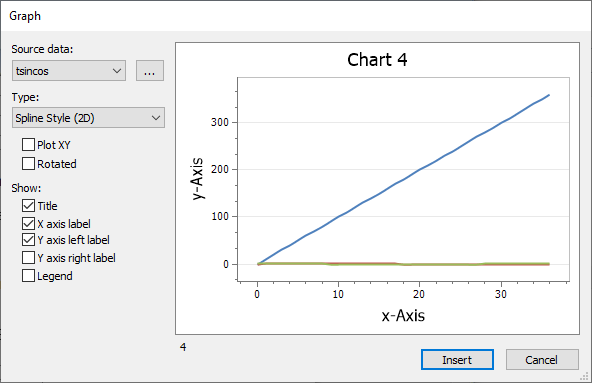
This probably isn’t what we expected! It happens because by default, SolvePro tries to display all three columns as three separate traces. To generate the graph we require, check the Plot XY option and everything will resolve itself to give the chart we want.
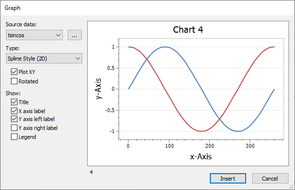
If you check the Format graph options, you’ll discover that the graph is automatically set up with the first column (column 0) as the x-axis values and the second and third columns set up as the first and second traces. All that needs to be done now is to change the series names and the titles to suit.
The Create Graph option we used in the previous section automatically sets up the chart to use column 0 as the x-axis value and any subsequent columns as the y-values.
Tangent revisited
As previously seen, we can create a graph of the tangent function by removing the values which we don’t require so that infinities are not encountered. That allows us to create a graph which represents the tangent function, but it does indicate that the maximum values at around 90° and 270° are about 60. This is not quite correct. An alternative approach is to create a series of ranges and display each as a seperate trace on the graph.
We can create ranges using 0.5 degree increments of 0 – 89.5, 90.5 – 269.5 and 270.5 – 360 but not join them together. That is,
r1 = rangeint(0, 89.5, 0.5) = {180}
r2 = rangeint(90.5, 269.5, 0.5) = {359}
r3 = rangeint(270.5, 360, 0.5) = {180}
We can now create the y-axis tangent values for each of the three ranges r1, r2 and r3
rtan1 = {180}
rtan2 = {359}
rtan3 = {180}
Creating a graph from these vectors with rtan1 as the first series and r1 as the x-axis value for this range, etc produces the following
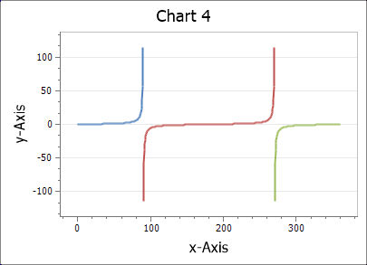
Since the individual values are close together, using a spline line style can create some odd-looking artefacts. Changing the style from a spline to the simple line style removes this problem. In any event, this is very obviously three separate traces, so changing the colours for the second and third traces in the Format graph dialog so that they all match the first trace generates the final graph